-
393 Comments sorted by
-
Reminds me of the old joke
Jesus saves!
But Dalgleish scores from the rebound !The Moving Finger writes; and, having writ.
Moves on: nor all thy Piety nor Wit.
Shall lure it back to cancal half a line,
Nor all thy Tears wash out a Word of it. -
Not my own art obviously, but I thought I'd post a link to a site that's drawn my attention recently - www.maleonn.com He's an Asian artist many here might like? His stage set works remind me of the Surrealist Remedios Varo 's narrative paintings, which I also adore. I'd be interested in your thoughts?
-
KatRobin said:
Not my own art obviously, but I thought I'd post a link to a site that's drawn my attention recently - www.maleonn.com He's an Asian artist many here might like? His stage set works remind me of the Surrealist Remedios Varo 's narrative paintings, which I also adore. I'd be interested in your thoughts?
Oooh, I really like his art!
Especially this one.
-
My local cemetery. The great Tony Wilson of Hacienda fame lies here.

-
In this case, someone elses art for our consumption.
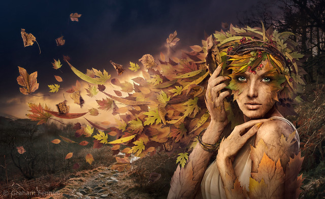
This is a friend of mine called Graham. Aside from the day job, this took him 2 months and contains over a 1000 layers on Photoshop. As he puts it, 'the hands and face are stock images but everything else, every leaf, twig and branch was individually photographed and then manipulated and brought into the image one layer at a time'.
Called 'And Autumn, she departs'. I look forward to seeing the other 3 seasons given the same treatment.
Post edited by Urban_Tribesman at 2014-08-10 18:59:43The Moving Finger writes; and, having writ.
Moves on: nor all thy Piety nor Wit.
Shall lure it back to cancal half a line,
Nor all thy Tears wash out a Word of it. -
Urban_Tribesman said:
In this case, someone elses art for our consumption.
This is a friend of mine called Graham. Aside from the day job, this took him 2 months and contains over a 1000 layers on Photoshop. As he puts it, 'the hands and face are stock images but everything else, every leaf, twig and branch was individually photographed and then manipulated and brought into the image one layer at a time'.
Called 'And Autumn, she departs'. I look forward to seeing the other 3 seasons given the same treatment.
It looks quite impressive! It looks quite "real" for a photomanipulation, so I instantly believe you when it said it took him so long to create this.And don't be sad @Sparky ! I really like the photo of the statue that you've posted earlier :) -
Here's a home-recording of a cover we did of Philco Fiction's "Finally"
http://soundcloud.com/andrekuijpers/finally-philco-fiction-cover/s-esSvg -
Project I did with two friends last month.
We started from zero and ended up with a whole studio full of ribbons. :DBe patient. -
 Hi this is my entry for a mural competition in Manchester's Gay Village. The idea is to bring art to the bars and buildings to make the place more interesting and raise funds for a communal arts space.You can view all 29 entries here http://goo.gl/FR78rA and you can award a Gold, Silver and Bronze to three lucky artists here https://www.surveymonkey.com/s/RSMCLVHThe competition closes very soon so please vote before the weekend. I'm entry number 20 and you can see how it might look above, and also below, how a paper collage from 1999 could end up 3 storeys high!
-
i voted sparky, for yours obviously. but also for the only one that seemed to show a woman/lesbian (why don't the girls ever get involved in this sort of thing?!), and the one that said 'together we're stronger'. That parking barrier looks like it could be quite painful for your chap, good luck with the comp!
-
Cheers Ping, much appreciated. It does seem to be a bit male/drag/transgender oriented. To be honest most of the entries are from one guy, so much for diversity. If I get the chance, I'll raise your point with the organisers.
-
I voted for yours Sparky, and in second place the cute rodent design ( cos I'm assuming it's a beaver?! Ho ho). Good luck! X
Howdy, Stranger!
It looks like you're new here. If you want to get involved, click one of these buttons!


