
Welcome to the new Goldfrapp forum. Enjoy your new home! X
-
74 Comments sorted by
-
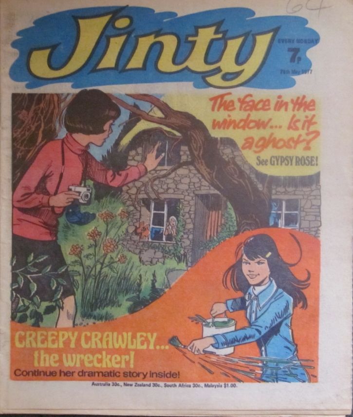
^ Thank you for that. I can see the attraction in this comic. My congratulations on managing to keep the fragile publication for so long. And yes, I can see the price 1/9 rubber stamped into one of the few places available on this crowded cover. I can't read the letters above the price, but speculate that they might be TP for Thorpe and Porter of Oadby, Leicestershire who distributed (amongst other things) Mad Magazine.I was also interested by the date -- October 1966 -- which was roughly when I first saw an American superhero comic. (In fact, it was either that month or the following one.) I wonder if this was about the time such comics first became available in the UK. American comics were available in the UK in the mid to late 1950s, but the only ones I saw at that time were either westerns or war stories. As I recall, our local post office sold them (not the newsagent over the road, which seems odd). The western comics in particular seemed to me woefully dull.Here's a busy cover from my collection: Jinty for 28th May 1977. The upper picture seems intended to be spooky, but to my eye the lower one is more disturbing.
 My website: http://petjeffery.co.uk/
See also: http://chomupress.com/our-books/jane/
And on Amazon: http://www.amazon.co.uk/-/e/B009CAXH8G -
You could start an animation thread PG !
I am sure plenty would be interested in that.The Moving Finger writes; and, having writ.
Moves on: nor all thy Piety nor Wit.
Shall lure it back to cancal half a line,
Nor all thy Tears wash out a Word of it. -
Urban_Tribesman said:
You could start an animation thread PG !
I am sure plenty would be interested in that.
Including me, perhaps. I have quite a bit of classic animation on DVD, and could post on how brilliant Van Beuren cartoons of the early 1930s were... or, it come to that, bitch about how crap Family Guy is.My website: http://petjeffery.co.uk/
See also: http://chomupress.com/our-books/jane/
And on Amazon: http://www.amazon.co.uk/-/e/B009CAXH8G -
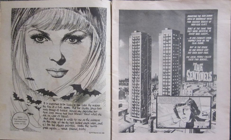
Returning to comics, here's pages 2 and 3 of Misty issue 2. To left (page 2) Misty (with more bats than usual) introduces the comic. To the right (page 3) the eponymous tower blocks of The Sentinels (part 2 of 12) give this spooky comic a gritty and modern feel.
 My website: http://petjeffery.co.uk/
See also: http://chomupress.com/our-books/jane/
And on Amazon: http://www.amazon.co.uk/-/e/B009CAXH8G -
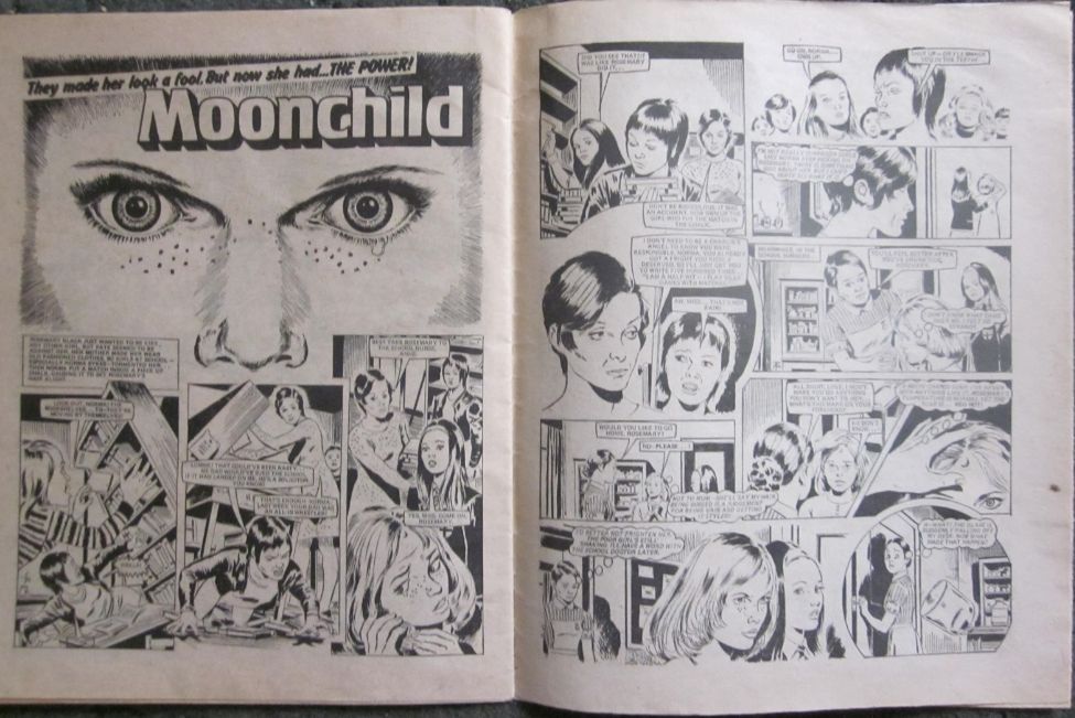
In Misty, the eyes often convey a great deal -- as here in the second installment of Moonchild. (The story concerns a girl with telekinetic abilities, and has been compared with Carrie.) Post edited by Pet at 2014-07-01 05:07:56My website: http://petjeffery.co.uk/
See also: http://chomupress.com/our-books/jane/
And on Amazon: http://www.amazon.co.uk/-/e/B009CAXH8G -
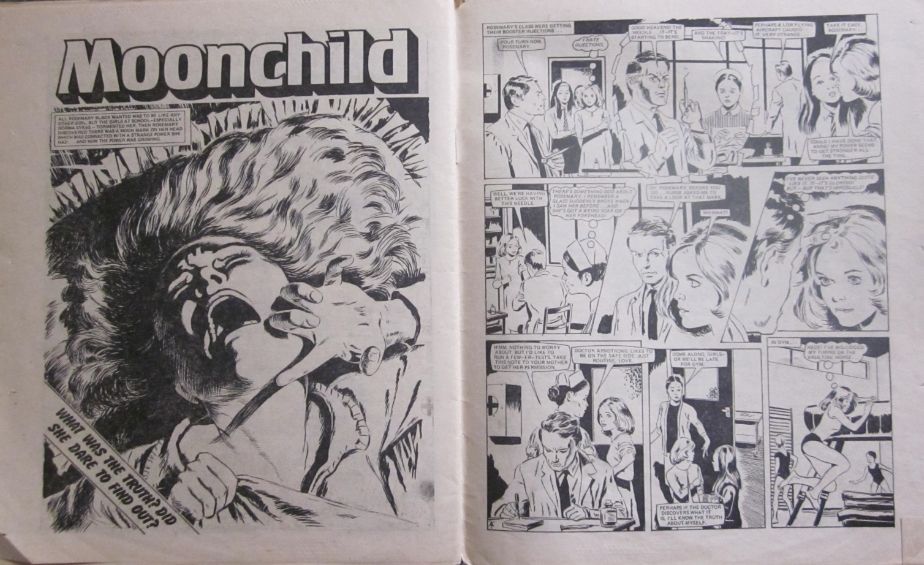
Bother! I copied and pasted the wrong image (and don't seem able to delete it). Here (I hope) is the Moonchild one I meant to post:
 Post edited by Pet at 2014-07-01 05:13:07My website: http://petjeffery.co.uk/
See also: http://chomupress.com/our-books/jane/
And on Amazon: http://www.amazon.co.uk/-/e/B009CAXH8G -
Ponygurl said:
Oh man, Moonchild looks pissed! There's a tear on her freckles.
Moonchild is upset and not best pleased in that picture. People should think carefully before upsetting girls with telekinetic powers.My website: http://petjeffery.co.uk/
See also: http://chomupress.com/our-books/jane/
And on Amazon: http://www.amazon.co.uk/-/e/B009CAXH8G -
Installment 4 of Moonchild started with a particularly memorable image.
 My website: http://petjeffery.co.uk/
See also: http://chomupress.com/our-books/jane/
And on Amazon: http://www.amazon.co.uk/-/e/B009CAXH8G -
And I particularly like the cover of Misty issue 4 (from which that last image came).
 My website: http://petjeffery.co.uk/
See also: http://chomupress.com/our-books/jane/
And on Amazon: http://www.amazon.co.uk/-/e/B009CAXH8G -
Who are the artists in these comics Pet? There seems to be a common style so either the same artist or they are working to a tight format as they did in the American comics. There, a hero has a set of standard drawings, with their image rendered from every conceivable angle so that the teams of artists that work for the company have something to refer to when they draw, so that the hero's image is always kept within a tight set of 'standards'. I have always been surprised that the artwork was produced by one artist in pencil, and then usually a different artist would ink the drawings, adding the colour, or sometimes, these three processes, pencils, inking and colouring, were done by three different people. The penciler, the person who actually creates the original image, is the one who receives the main credit. I assume this production line technique was done to increase the speed with which the comic was produced. As well as Neal Adams, another favourite ( perhaps in honor, I should drop all the 'U's and say favorite ) was Jim Aparo.The Moving Finger writes; and, having writ.
Moves on: nor all thy Piety nor Wit.
Shall lure it back to cancal half a line,
Nor all thy Tears wash out a Word of it. -
The artists who created UK comics were not usually credited, but in some cases they've been identified.Moonchild was drawn by John Armstrong. It seems, on the basis of a long interview published in a Misty fan magazine in 2009, that he was sent the script and then did all the artwork himself. John Armstrong is not easy to Google, as there seem to be quite a lot of men with the same name. There's some information on the correct John Armstrong here: http://ukcomics.wikia.com/wiki/John_Armstrong ...and here: http://en.wikipedia.org/wiki/John_Armstrong_(comics) ...I can't get that second link to display (or work) properly.The pictures of Misty herself were the work of a lady called Shirley Bellwood. See here: http://ukcomics.wikia.com/wiki/Shirley_BellwoodPost edited by Pet at 2014-07-02 20:21:07My website: http://petjeffery.co.uk/
See also: http://chomupress.com/our-books/jane/
And on Amazon: http://www.amazon.co.uk/-/e/B009CAXH8G -
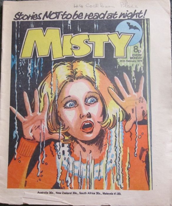
On the latest Jinty comic, I wonder who lived at 44 Cockburn Place?
Being in France at the moment, I cannot get to my collection to post some interesting covers but below is a link to what are seen as some of the best cover art from the Bronze Age of American comics, which was 1970 to 1985. The covers were not always drawn by the same artist as the story in the comic itself, and was generally an exaggerated scene from the story, such as Batman carrying a lifeless Robin, or as in this link, a lifeless Catwoman (another for @Hunter ). This appears to be a similar device as used in earlier filmed series, such as Flash Gordon, where at the end of the episode, you would clearly see Flash go over the edge df a cliff only to see, at the beginning of the next episode, he manages to throw himself clear just in time. A sort of invitation to treat !
Batman Bronze Age covers
The Moving Finger writes; and, having writ.
Moves on: nor all thy Piety nor Wit.
Shall lure it back to cancal half a line,
Nor all thy Tears wash out a Word of it.


Howdy, Stranger!
It looks like you're new here. If you want to get involved, click one of these buttons!